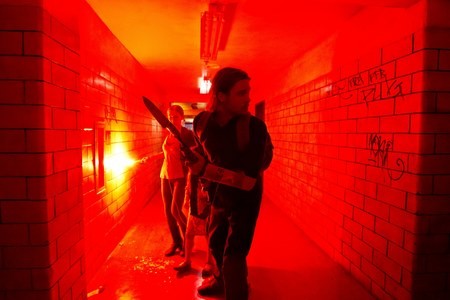
- Paramount Pictures
- Be vewwy, vewwy quiet. I'm hunting zombies.
I visited my old friend Dan this past weekend and we got to talking about the films we’d seen recently, as he and I often do. As it happened, we’d both seen World War Z, a movie we’d missed in the theaters, within the previous week. “So you saw it listed in the ‘New on Netflix’ list, too, huh?” he asked. Indeed I had.
There’s plenty to say about the myriad ways Netflix has insinuated itself into the lives of cinephiles everywhere: how it breaks the longstanding distribution model, how it pushes back against the nasty cable companies, how its archives of old films runs a lot deeper than you might think. Personally, I’m pulling for Netflix to slay a few Goliaths in a rise to even greater prominence. I’m not usually on the side of corporations, but I like this one’s scrappiness (as well as its extensive archive of 1950s Westerns). But I’ll save all that for another column.
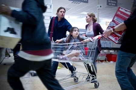
I’d heard that World War Z was a somewhat grim, uninteresting affair, but I found it to be precisely the opposite. Despite the fact that I’ve gone on record many times saying it was a fool’s errand to make a zombie film in the wake of Shaun of the Dead — since that masterpiece is basically the last word on this overdone subgenre — I enjoyed World War Z quite a bit. It’s solid, smart genre filmmaking with a decent degree of visual sophistication.
The film’s director, Marc Forster, is a somewhat chimerical journeyman. I haven’t seen all of his films but, of the ones I have seen, some (Quantum of Solace, Finding Neverland) struck me as almost impossibly dull, while others (Stranger Than Fiction, World War Z) are highly intelligent, visually speaking. Haven’t figured this guy out yet.
The opening scene of Stranger Than Fiction demonstrates that Forster understands how to use imagery not only to advance the story but to enhance it on a visual level. In that scene (watch it below), the director uses an unusual device to comment on the rigidity and regularity with which the main character, Harold (Will Ferrell), lives his life.
Harold’s life is governed by numbers and routines, as explained by the voice of the narrator (Emma Thompson). Forster illustrates and enhances the importance of those routines with digital images of directional arrows and diagrams. These images seem to exist on Harold's plane of reality: They are so vivid as to nearly achieve solidity. It’s a highly unusual device (owing something to the IKEA parody scene in Fight Club) that shows how important these routines are to Harold.
The effects in this scene also leave a lasting visual impression. We’ve not often seen this kind of thing before, and it is lovely, surprising and charming. I have not revisited the film since I first saw it five or six years ago, but I remember thinking that Stranger Than Fiction failed to follow through on its visual promise: The illustrated-diagram effect does not return in any other scenes. (Please correct me if you know the film better than I do.) Too bad, I thought. The film is cute, but I found the moments with the digital illustrations the most interesting by far.
I found a subtler visual intelligence in World War Z. I admired this film for what it omits as much as for what it includes. Two examples — one on a larger scale, both from an early scene in a bombed-out apartment building in Newark.
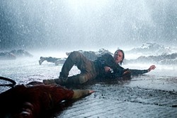
- Paramount Pictures
- A highlight of World War Z: the tense, darkly funny scene on the rainy airport in South Korea
“Movimiento es vida,” he says to the Latino parents, inviting them to come along. The family refuses but gives the Lanes some supplies and wishes them well.
By this point in the film, we’ve seen how quickly a previously healthy person, once bitten, becomes a zombie: in a few minutes. Just before Gerry and his family are rescued by a U.N. helicopter on the roof of the building, a bunch of persistent zombies run after them, as do a couple of lucky survivors. Among the undead is Tomás’ father; among the living is Tomás.
We don’t need to have spelled out for us what has happened. Tomás has somehow eluded the zombies, but his father was not so fortunate. To show us yet another human-to-zombie transformation would have been redundant, Forster apparently realized. It’s more powerful — not to mention narratively efficient — for us to imagine Tomás’ horror in witnessing his parents’ transformation, and his flight from his once-safe home to the building’s roof.
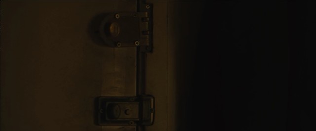
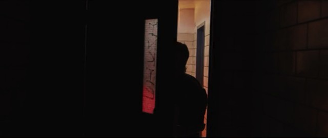
The smaller-scale subtlety in this same scene — and the one I particularly appreciated — is a simple edit. Specifically, it’s a graphic match, a type of edit in which two visually similar shots are juxtaposed for narrative and/or visual effect. And it’s a simple graphic match — a shot of a door is matched with a shot of another door. But it’s powerful, because it visually indicates the differences between one choice and another, between movement and stasis, life and death, living and undead.
The scene in which this graphic match occurs is the one in which Gerry and his family leave the apartment of Tomás’ family. As the Lanes gamely head into the zombie-infested hallway, Tomás’ family remains in their home.
The first of the two shots in this match is of the inside of the front door of the apartment. From the father’s approximate point of view, we watch as the door cracks and buckles and the lock-plate is dislodged. Angry zombies are pounding on the door — a sure sign that the apartment’s residents can't hold out much longer.
- Paramount Pictures
- Graphic match, shot 1: Zombies pound at the apartment door.
Immediately after this shot, Forster cuts to the second half of the match: a shot of Gerry opening a door in another hallway of the building. In fact, these shots are matched not just by the doors but by the outward (farther-to-closer) movement. In the first, the door buckles toward the camera with the force of the zombies’ blows; in the second, the door swings outward toward the camera when Gerry pushes it open from the other side.
- Paramount Pictures
- Graphic match, Shot 2: Gerry pushes through a different door.
It’s a terrific, and terrifically simple, cut. One instant shows a doomed family; the next instant shows, in a graphically similar manner, a family that, against all odds, is surviving.
For the next several minutes, we stick with Gerry and his family, learning nothing more about Tomás’ until the poor kid’s zombified father bursts through the door onto the rooftop. The cut tells us everything we need to know.
The graphic match is hardly a new trick; indeed, editors figured it out more than a hundred years ago, pretty much at the dawn of editing itself. But that doesn’t mean it can’t still pack a punch. Its clever, narratively salient, visually simple yet powerful use in World War Z is one of the techniques that proves this film is more visually sophisticated than many other American genre films. I enjoyed the picture, but this single graphic match made the whole film worthwhile.
- Paramount Pictures
- World War Z
Speaking of...
-

A New Film Explores Vermont’s Unsung Modernist Buildings
Mar 20, 2024 -

A Film Critic Pays Final Respects to the Palace 9
Nov 11, 2023 -

Next Month Brings the Final Curtain for Palace 9 Cinemas
Oct 27, 2023 -

Director Jay Craven Wins 10th Annual Herb Lockwood Prize
Oct 21, 2023 -

Book Review: 'Save Me a Seat! A Life With Movies,' Rick Winston
Aug 30, 2023 - More »



Comments
Showing 1-1 of 1
Comments are closed.
From 2014-2020, Seven Days allowed readers to comment on all stories posted on our website. While we've appreciated the suggestions and insights, right now Seven Days is prioritizing our core mission — producing high-quality, responsible local journalism — over moderating online debates between readers.
To criticize, correct or praise our reporting, please send us a letter to the editor or send us a tip. We’ll check it out and report the results.
Online comments may return when we have better tech tools for managing them. Thanks for reading.